T-test
This time we will use a dataset named midwest.
Download the dataset from SurreyLearn and load it into RStudio. To load our file we use the load() function. Give a name to your dataset using the assigment operator <-.
Let’s have a look at the dataset. Alternatively, you can have a look at the codebook- that is the document that comes with the dataset. The codebook describes the contents, structure, and layout of a data collection but it also provides a detailed overview of all variables included in the dataset.
We will explore our dataset, by using the head() and View() functions.
The head() function shows us the head, the first rows, of our dataset.
The view() function allows us to see inside the data frames. At the view window you can also sort the dataset by any column simply by clicking on the column.
Let’s start by examining the one paired t-test. That means that we will compare the mean of our sample against a known true value. To be more specific, we will calculate the percent of educated adults in the midwest, against a known value the percent of educated adults nationwide. Our overall aim is to examine whether the mean of educated adults in the midwest is significantly different to the national average. That means it could be higher or smaller.
According to official statistics, the percentage of college educated adults is \(32%\), our aim is to examine if in the midwest the average of college educated adults is statistically different to \(32%\).
A boxplot can give us a quick visual assessment of the data, a brief idea about what is going on in our data before we perform the t-test.
To do so we will use a very useful package in R, called ggplot2.
We first have to install ggplot2 by using the install.packages("ggplot2") function:
plot1 <- ggplot(midwest, aes(percollege)) +
        geom_histogram() + theme_classic()

plot1 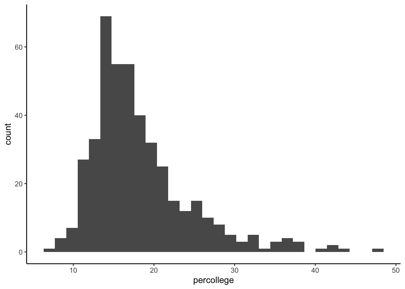
One-tailed t-test
Our next step is to perform the one-tailed t-test. Taking into consideration the states that are part of the Midwest, we hypothesise that on average the percentage of educated adults will be smaller than the average.
t.test(midwest$percollege, mu = 32, alternative = "less")##
## One Sample t-test
##
## data: midwest$percollege
## t = -45.827, df = 436, p-value < 2.2e-16
## alternative hypothesis: true mean is less than 32
## 95 percent confidence interval:
## -Inf 18.7665
## sample estimates:
## mean of x
## 18.27274Note: 2.2e-16 is 2.2 x 10⁻¹⁶ which is 0.00000000000000022
Two tailed t-test
Our next step is to compare the difference between two different states. In other words, our next step is to compare whether the two means, representing two different groups, are statistically different. This is called two sample t-test.
Before we start, install a package called dplyr and use the library() function to load it in RStudio.
Create the two groups
We start by creating the two groups:
library(dplyr)
data.frame1 <- midwest %>%
        filter(state == "IN" | state == "IL") %>%
        select(state, percollege)
We can examine the distribution of the two groups with a box-plot:
ggplot(data.frame1, aes(state, percollege)) +
        geom_boxplot() +
  labs(title = "Two paired t-test",
       y="Education",
       x="State") +
  theme_classic()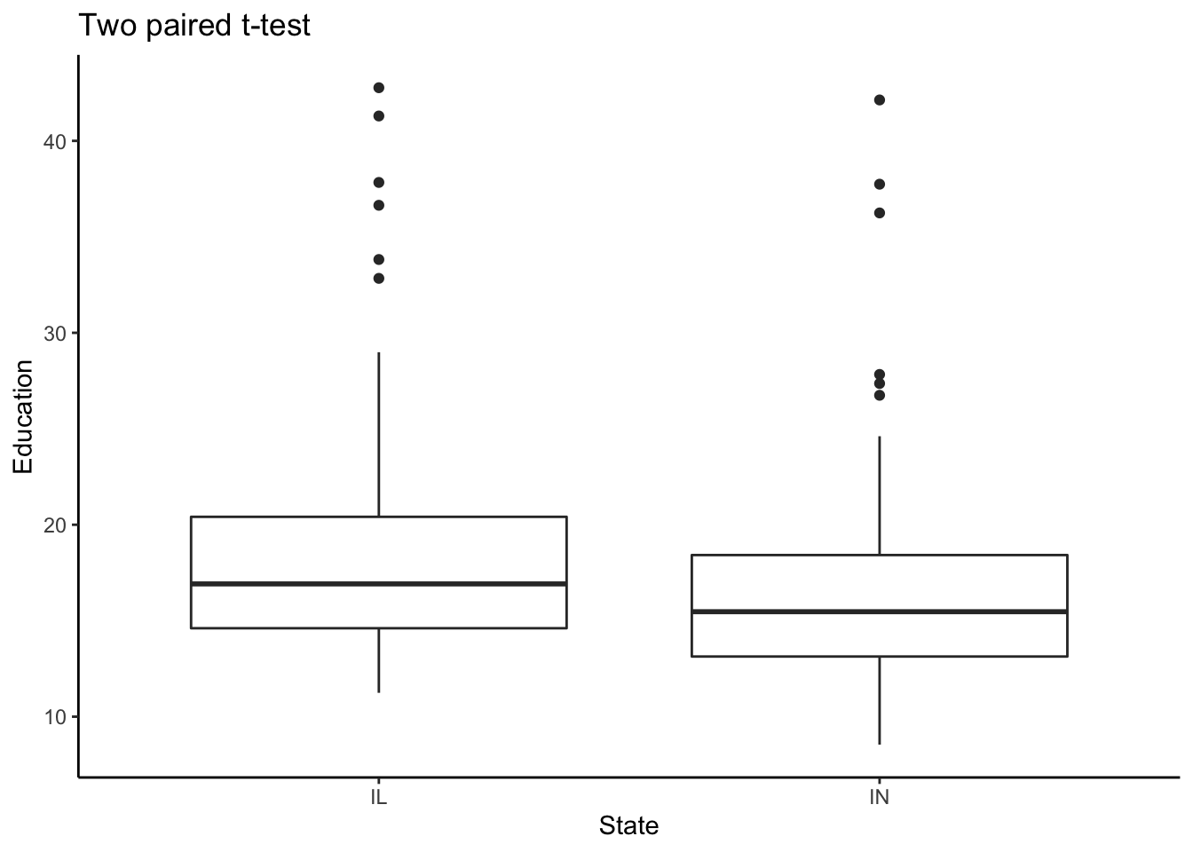
Our next step is to compare the two means:
t.test(percollege ~ state, data = data.frame1)##
## Welch Two Sample t-test
##
## data: percollege by state
## t = 2.4947, df = 191.61, p-value = 0.01345
## alternative hypothesis: true difference in means is not equal to 0
## 95 percent confidence interval:
## 0.4533698 3.8774354
## sample estimates:
## mean in group IL mean in group IN
## 18.78814 16.62274The results of the analysis suggest that the p< 0.05 is supporting the alternative hypothesis that the true difference in means is not equal to zero. What that really means is that there is a statistical difference between the two means.