Graphs-categorical variables
Learning Objectives
By the end of this section you should be able to:
- Understand and use aesthetic mapping within ggplot2
- Plot a barplot using categorical data
- Make adjustments to the theme and legend of you barplot
Below you will find some examples of graphs for categorical variables. Of course there are many more graphs available to help you visualise your hypothesis and research question.
Bar Plots
Let’s use this minimal example to see how ggplot works.
library(ggplot2)
plot1<-ggplot(EVS_UK, aes(x = gender)) +
  geom_bar() +
  theme_classic()

plot1 # You can't view the plot unless you call it 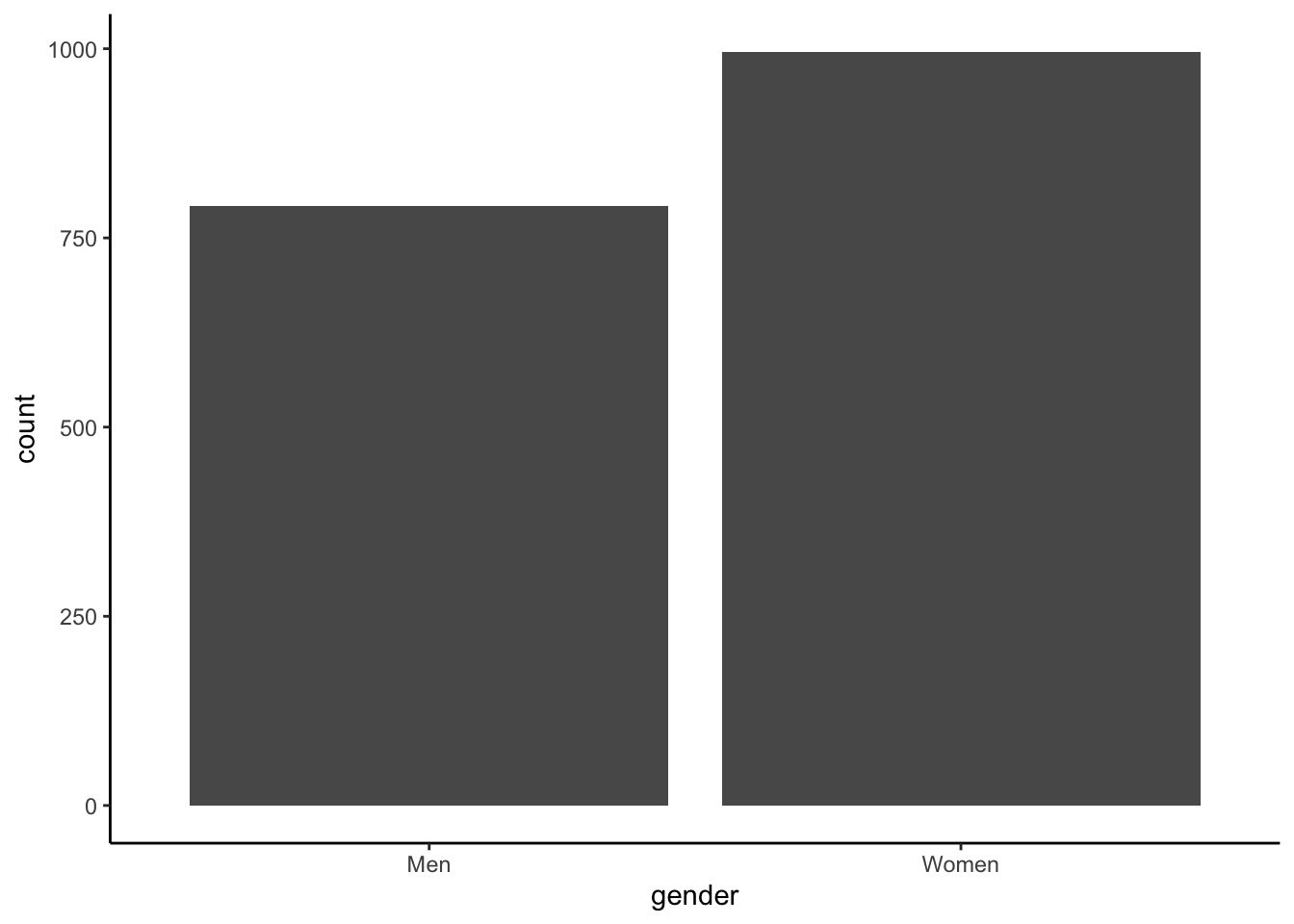
Our first step is to give meaningful names to the values of our variable (gender). In our dataset \(1\) represents men and \(2\) women.
plot1<-plot1 + scale_x_discrete(breaks=c("1", "2"),
                      labels=c("Men", "Women"))
plot1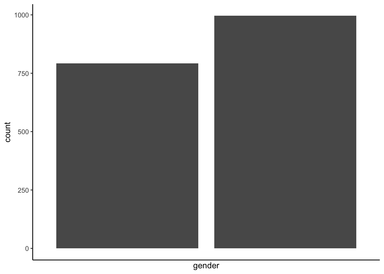
Let’s give labels to our axes, again we call our plot, plot1 and by using the \(+\) sign we call the labs function, part of ggplot.
plot1<- plot1 +labs( y="Number of cases", x = "Responder's gender")Additionaly we may create a barplot describing two variables gender and educational level. We build upon the exisitng graph plot1:
plot1<-plot1 + geom_bar(aes(fill = education))
plot1
We can move the position of the legend:
plot1 + theme(legend.position="top")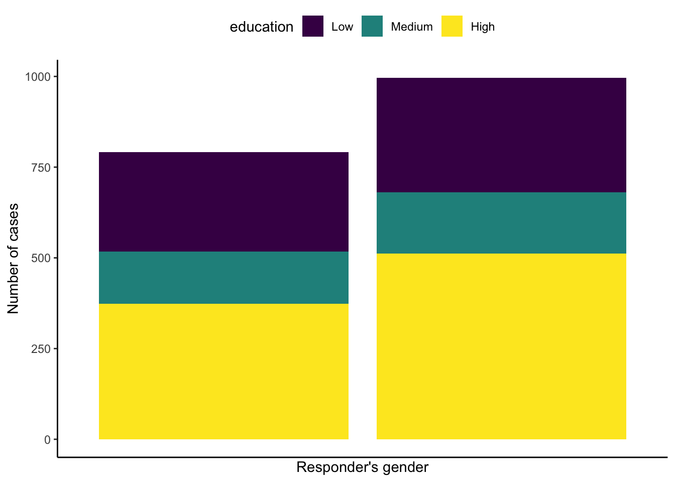
Or, we may position the legend in the graph:
plot1<-plot1 + theme(legend.position = c(0.25, 0.9),
          legend.direction = "horizontal")
plot1 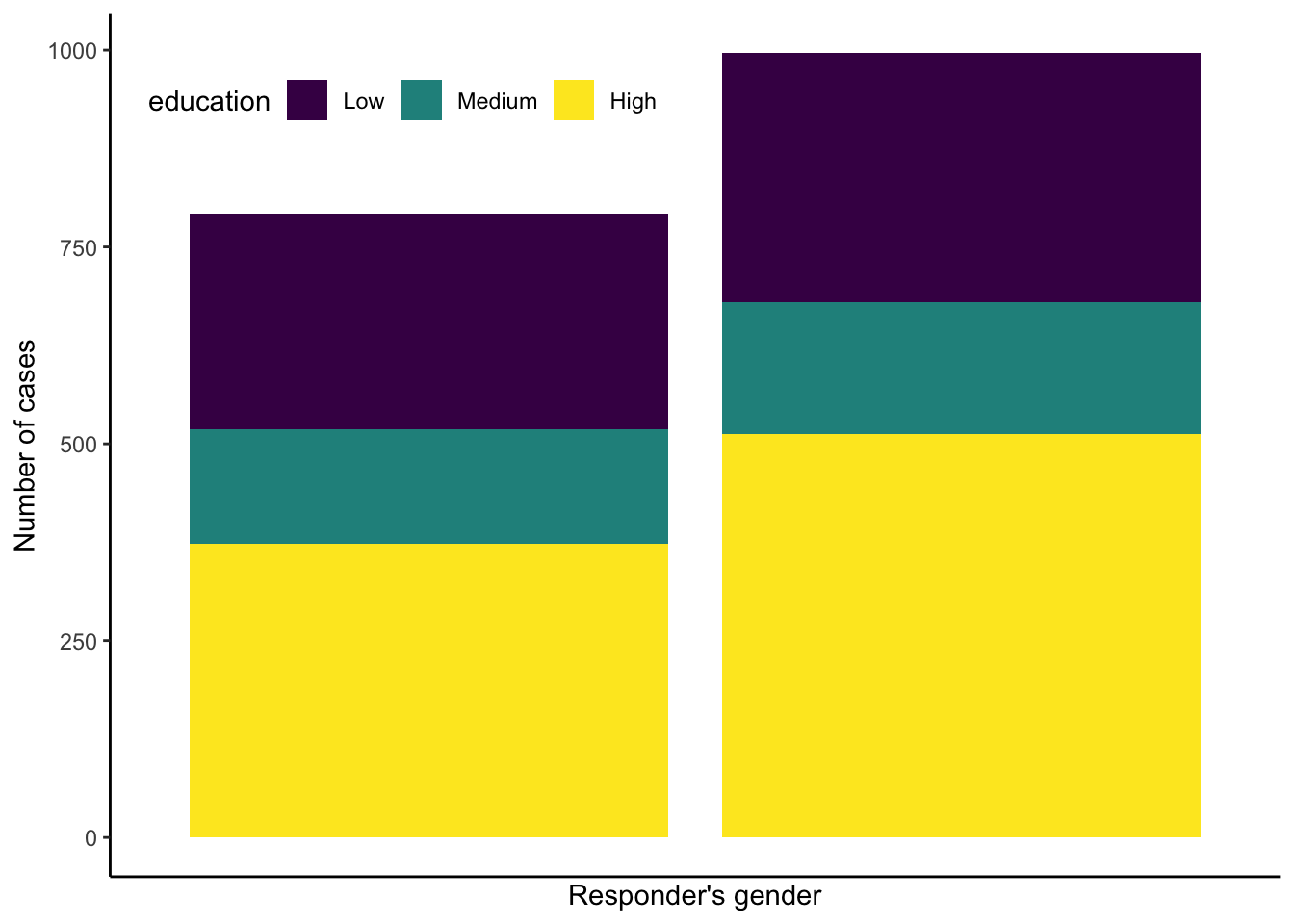
As you may have noticed typically I am using a white background for my graphs. We may change the background by using different backgound themes. The most commonly used themes are the following:
| Function | Theme |
|---|---|
| theme_gray() | Grey background and white gridlines |
| theme_bw() | Classic dark-on-light |
| theme_minimal() | A minimalistic theme with no background annotations |
| theme_classic() | A classic-looking theme, with x and y axis lines and no gridlines |
plot1<-plot1 + theme(legend.position = c(0.3, 0.9),
          legend.direction = "horizontal") +
  theme_classic()

plot1 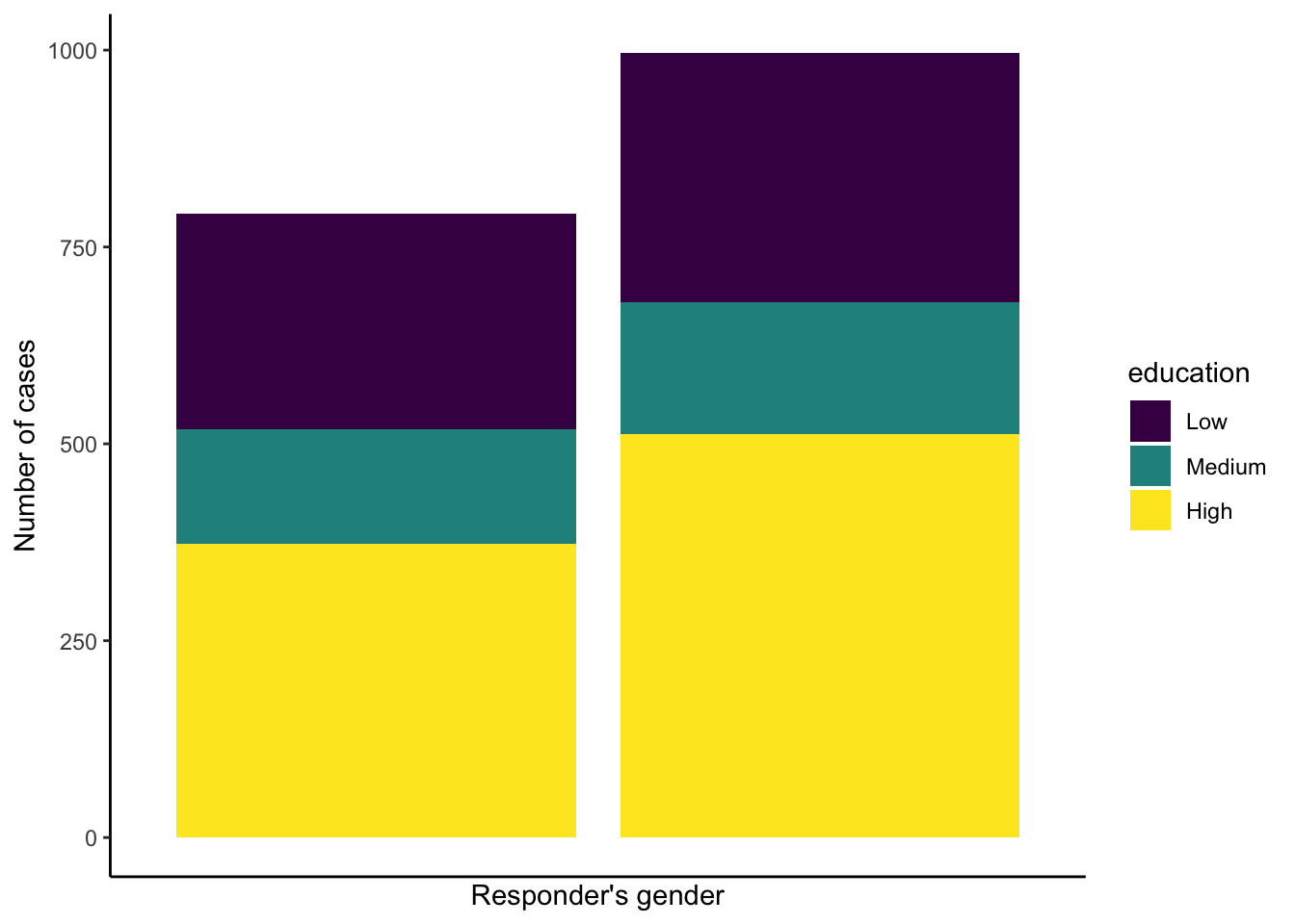
Additionaly we can plot the two bars, the one next to the other
plot2<-ggplot(EVS_UK, aes(x = education, fill = gender)) + geom_bar(position = "dodge") +
  theme_classic()

plot2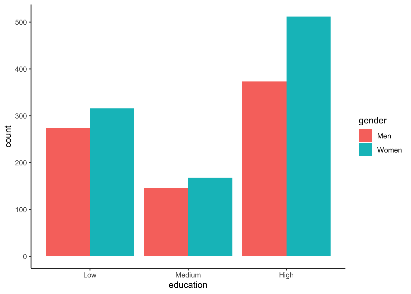
Recap
- You can control the aesthetic mapping within ggplot 2 using the
aes() - Categorical variables can be plotted on barplots using
ggplot() + geom_bar - Always ensure you prepare your data before plotting