Graphs-continuous variables
Learning Objectives
By the end of this section you should be able to:
- Understand how to plot continuous variables
- Use boxplots, line plots , violin plots and 3D plots for continuous variables
One continuous variable
For the following example we will use a variable describing citizens’ satisfaction with the political system, the name of the variable is v144. We will use the names() function to give a meaningful name to the variable.
The general formula is: names(my_data)[names(my_data) == “old.variable.name”] <- “new_variable_name”
names(EVS_UK)[names(EVS_UK)=="v144"]<- "pol_sat"

table(EVS_UK$pol_sat)
##
## 1 2 3 4 5 6 7 8 9 10
## 170 104 178 223 243 227 305 201 55 46plot5 <- ggplot(na.omit(EVS_UK), aes(gender,pol_sat))
plot5<-plot5 + geom_boxplot(varwidth=T, fill="mediumpurple4") +
labs(title="Box plot",
subtitle="Satisfaction with the political system by gender",
caption="Source: European Value Study (2019)",
x="Gender",
y="Satisfied with the political system")
plot5+theme_classic()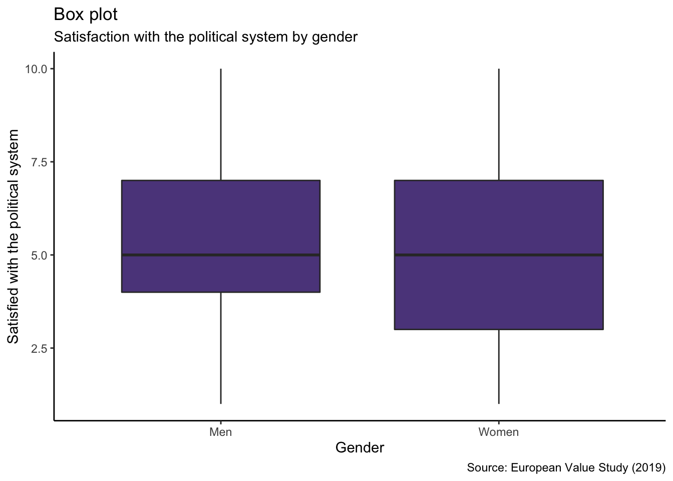
See here for all other colours available
Violin Plots
plot6 <- ggplot(na.omit(EVS_UK), aes(education, pol_sat))
plot6<-plot6 + geom_violin(fill="skyblue") +
  labs(title="Violin plot",
 subtitle="Satisfaction with the political system by level of education",
         caption="Source: European Value Study (2019)",
         x="Education",
         y="Satisfied with the political system")

plot6+theme_classic()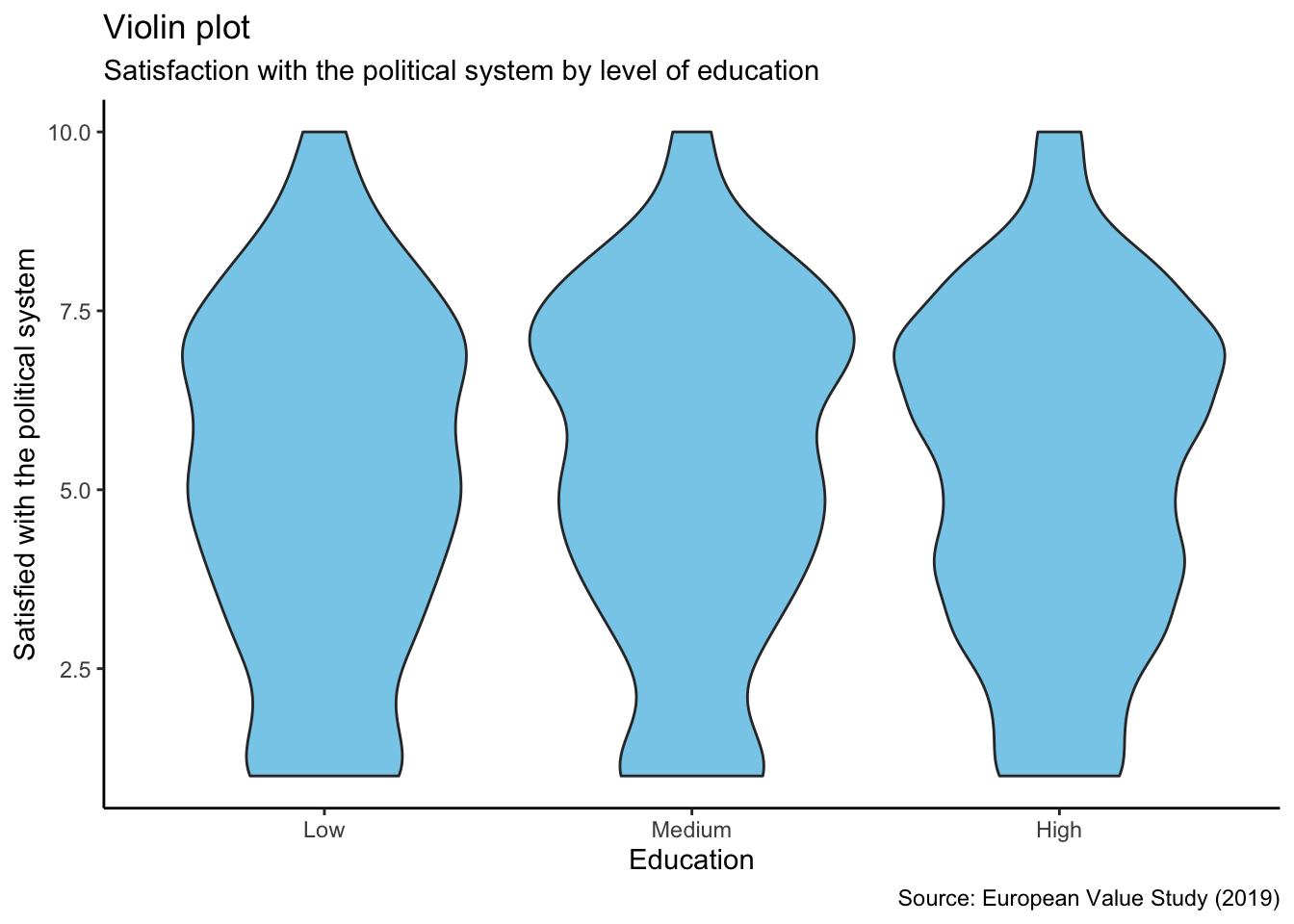
Continuous variables
Lines
In this section we will use the EconomistData dataset.
plot7 <- ggplot(data = EconomistData, mapping = aes(x = HDI, y = CPI)) +
    geom_line() +
    facet_wrap(facets = vars(Region))+
  labs(title= "Lines",
        subtitle = "Human development index versus consumer price index",
         x = "Human Development Index",
         y = "Consumer Price Index") +
    theme_classic()

plot7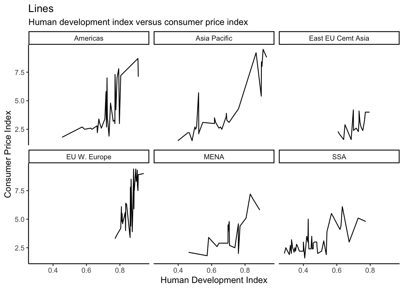
3D Plots: The plotly package
Let’s try to plot some 3D plots. To do so we should install an additional package entitled plotly, install.package("plotly").
library(plotly)EconomistData <- read.csv("EconomistData.csv")
plot8<- plot_ly(data=EconomistData, x = ~HDI, y = ~CPI, z = ~HDI.Rank, color = ~Region, colors = c('#7B68EE', '#800000')) %>%
add_markers() %>%
layout(scene = list(xaxis = list(title = 'HDI'),
yaxis = list(title = 'CPI'),
zaxis = list(title = 'HDI Rank')))
plot8Want to learn more about plotly? You may visit https://plot.ly/ggplot2/
Recap
- The
plotlypackage can be used to create 3D maps of continuous data. - Continuous data can be represented using a variety of plot types.
geom_boxplot()is used to create box plotsgeom_violin()is used to create violin plotsgeom_line()is used to create line plots