Visualising the relationship
Let’s plot the elationship between the two variables, dependent and independent, but this time we will include the regression line.
plot.2<-ggplot(GDP_Dem, aes(x=GDPPC1984, y=Dem_Gov1984)) +geom_point(size=3) +
stat_smooth(method = "lm", col = "red")+
theme_classic()+
scale_x_continuous(breaks = seq(0, 75000, by = 5000))+
scale_y_continuous(breaks = seq(0, 200, by = 10))+
labs(x="Democratic Governance", y="GDP Per Capita")
plot.2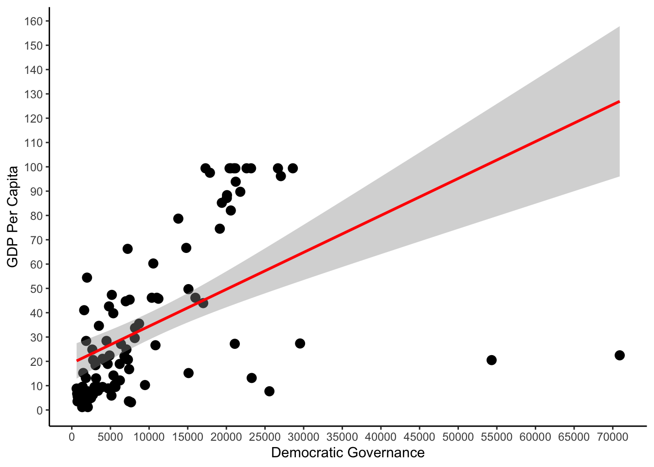
The graph replicates the table, when our independent variable is equal to zero, then the starting point of the line (the Y axis) is predicted to be approximately 20, the same as in our table (19.24).
By looking at the regression line we should also observe that the position of the line matches the coefficients we estimated, and reported in our table. The coeeficient for the variable describing GDP per Capita GDPPC1984 is 0.001519. The line seems to reflect this. First of all, the direction of the line imply that there is a positive relationship between the dependent and the independent variable. Indeed, the positive sign of the coefficient represents this positive relationship between the two variables. In other words, higher levels of GDP per Capita are associated with higher levels of Democracy. For each additional unit of GDP per Capita, Democratic Governance increases by 0.001519.